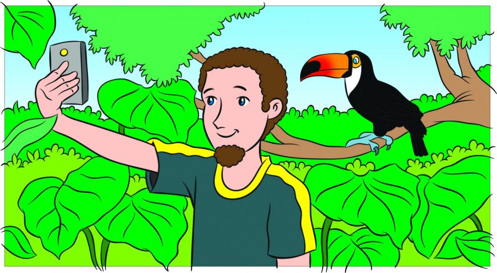
Today’s blog showcases our amazing illustrator, Doug Nash. You may have already read his staff profile (if not, then you can find it here.) We’re lucky to have an in-house Design department here at Garnet, so they’re always available for a chat. As Assistant Digital Editor at Garnet, I wanted to find out more about the images I work with every day. Doug kindly agreed to show me some of his work and talk about how he puts an artwork together.
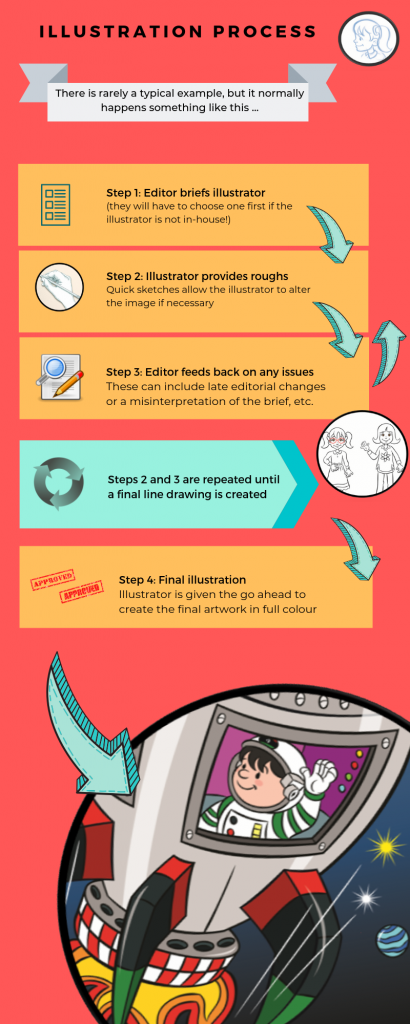
Whether you’re interested in becoming an illustrator or designer yourself, or you’re just curious about our publishing process here at Garnet, it’s a fascinating area. So let’s jump right in to Doug’s work!
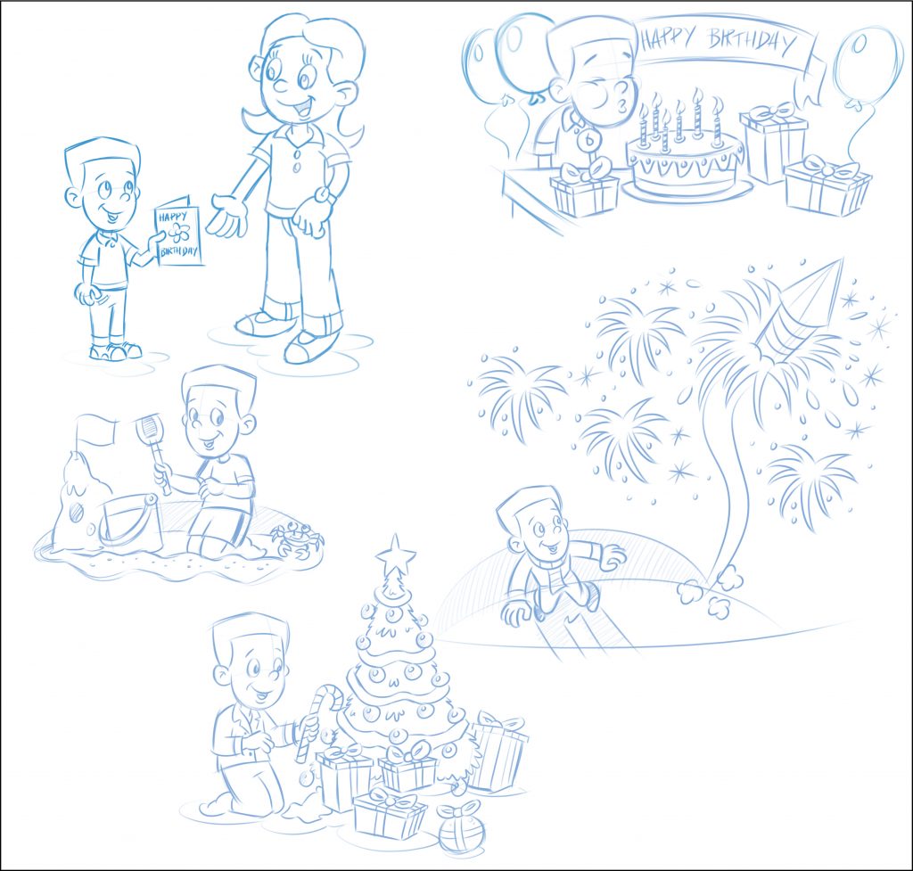

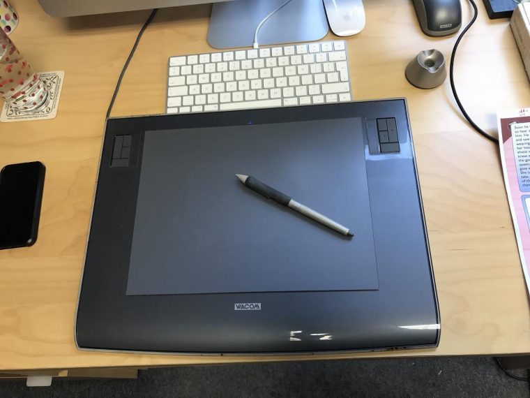
These days it’s common practice to create illustrations digitally from the start of the process, so Doug creates first sketches with a tablet and stylus.
Light blue is traditionally used for sketches because in the days of paper and ink, light blue pencil sketches would become invisible when scanned into the computer, so the image could be physically built up in stages. Nowadays, Doug can just make the sketch layer invisible in Photoshop, but old habits are hard to break, and it remains an industry standard to sketch in blue.
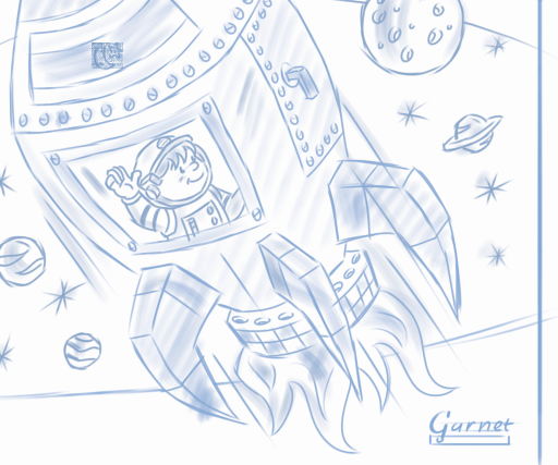

This traditional hand-drawn system could be stressful (for the editor as well as the illustrator!) as images could not be altered if a mistake was made or an editor changed their mind at the last minute.
When asked about this transition, Doug remembers that the system went from hand-drawn to digital very suddenly. He says his job ‘changed overnight!’ and he had rarely even used Photoshop before, so the learning curve was very steep. But at least this came with the freedom to alter images as needed – which is almost inevitable in the publishing process!
In some cases, Doug mentioned digital images can run the risk of looking a bit flat and almost cold compared to hand drawn ones. This is where his digital drawing pad’s ‘pressure sensitivity’ comes in, which helps breathe life back into the images.
An element of illustration that is very particular to an educational publishing context is that, in a book series, characters that you follow along with need to grow up along with the children who are using the course from year to year.
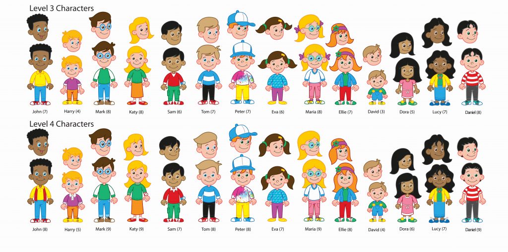
Here’s a middle-stage sketch of all the characters that appear in Level 3, and then Level 4 of our Talking Trinity course – a useful reference for keeping track of how they’re growing up!
Another technique that I’ve recently seen in action is a more comic book style of illustration, often used in courses for teenagers. A model is used (an office volunteer) and they are posed in the position needed. Doug then photographs them and transforms them into an illustration.

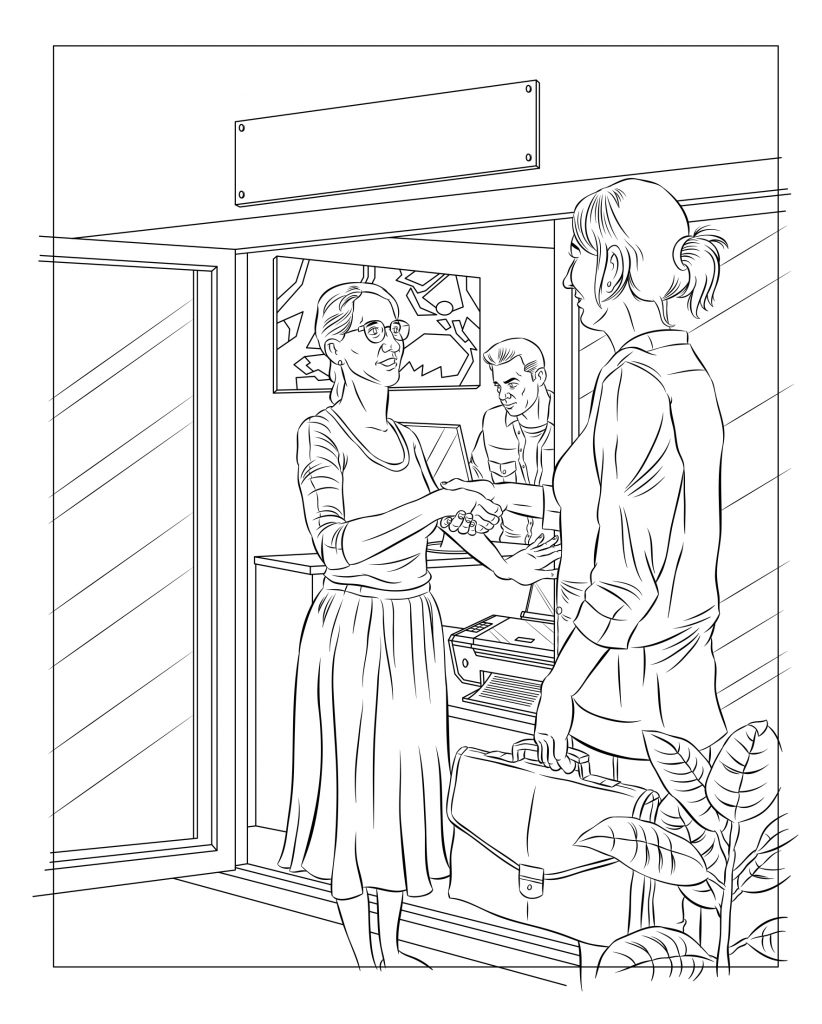

Thanks to Doug for chatting about his work with me over the past couple of weeks. I’ve loved seeing how illustration works from the other side of the editor / illustrator publishing process!
I’ll leave you with a Public Service Announcement from illustrators:
“If you don’t understand the brief then I haven’t got much chance of getting the illustration right!”
Doug also has his own website where he shows his other illustration work – take a look here.


